There was a single, imperitive thing about City‘s art that needed to be mastered before production could actually start. The GDD stated that the art should “mimic the styles used to create early comic books”. An entire Visual Guide was included in the original GDD, and this was used by the artists for their first task: Create art of whatever they normally would, but using the previously stated style. This was based on a suggestion given by the Year Tutor, but also gave me time to start some early prototypeing to get a better idea as to how the game would function, and as such how the art would need to be produced (e.g. what would need to be on which layer, how should the art be submitted etc.). The point of only focusing on the style of drawing first was to ensure I wasn’t throwing my artists in at the deep end…
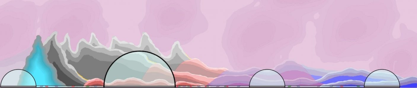
That came on the second week, with their second task. Each of the GDDs were based on books, with City Beyond The Stars deriving from The Gernsback Continuum (By William Gibson). As such, the content of the game was to be based on somewhat on Raygun Gothic. However, we changed this to Retrofuturism as we were having difficulty figuring out how to classify something as specifically Raygun Gothic rather than another form of Retrofuturism. It was during this second week that our Team’s Art Director (A role I had outsourced to another Team Member to cover my lack of artistic knowledge, based on a suggestion from yet again the Year Tutor) created an Art Bible for the project, a version of the prior Visual Guide made with insight based on what had been discovered during the art creation over the previous two weeks.
